Kantech
Everyone in tech says people come first. This one had nothing else to say it with.
Kantech was a business plan and a founder. No clients, no work to point at, a differentiator every competitor already claimed: people before technology. We made it structural rather than spoken, then built the identity, the copy and the site.
What we did
The real question
Kantech's differentiator was the human part of the business, and the founder had built the whole plan on it. It also sounded exactly like what every competitor already claimed, and had no track record behind it to settle the argument.
So the question wasn't what made Kantech different. It was how a new company takes the most claimed position in its category and gets taken at its word.
Starting point
A founder, a plan, and nothing to excavate
An established company can be read from the inside: culture, clients, years of behaviour to find a pattern in. Kantech had none of it. There was an experienced founder, a business plan, and a clear end state with no first step defined.
The company arrived with a perception problem and a suspicion that the name was part of it. What discovery confirmed was that the problem was structural rather than cosmetic.
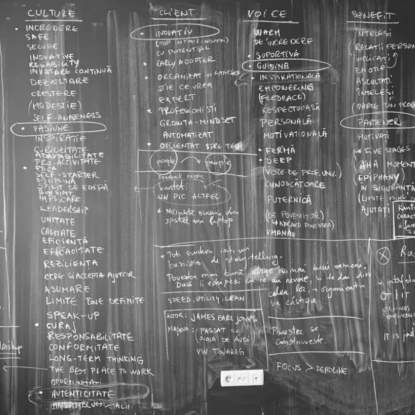
So discovery went at him rather than at the market. The human component came back from every direction, and not as an idea somebody liked. It was the reason the company was being started at all.
How we thought about it
Not a message. An order.
Said out loud, people first is a slogan, and the first thing you design can contradict it. So we made it a rule instead: what goes at the top of a page, what fills the first frame, what a proposal opens with.
A message gets forgotten by the next person who opens the file. An order either got followed or it didn't:

The decision
Digitalisation moves the work. It does not replace the judgement.
The purpose came out of it and the company still runs on it: to enable simplicity and inspire the digital transformation of business.
Underneath sits the argument. Technology is available to everyone in the category at roughly the same price, so it was never where the value was. The value is the human judgement standing next to it.

Evidence · the work
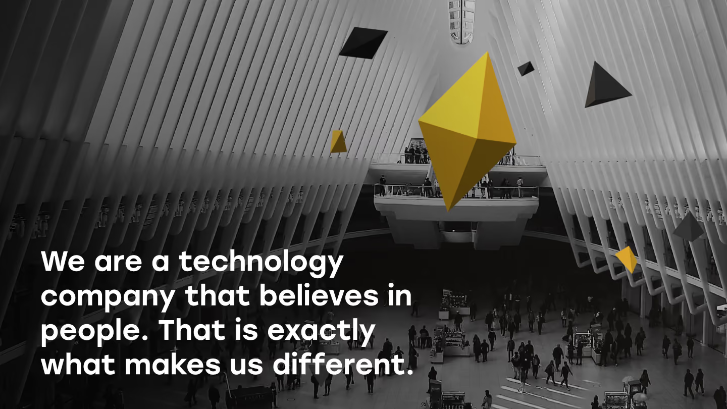
We took the category's colour away and put a face in its place
Two decisions carried the strategy into the identity, and both are subtractions.
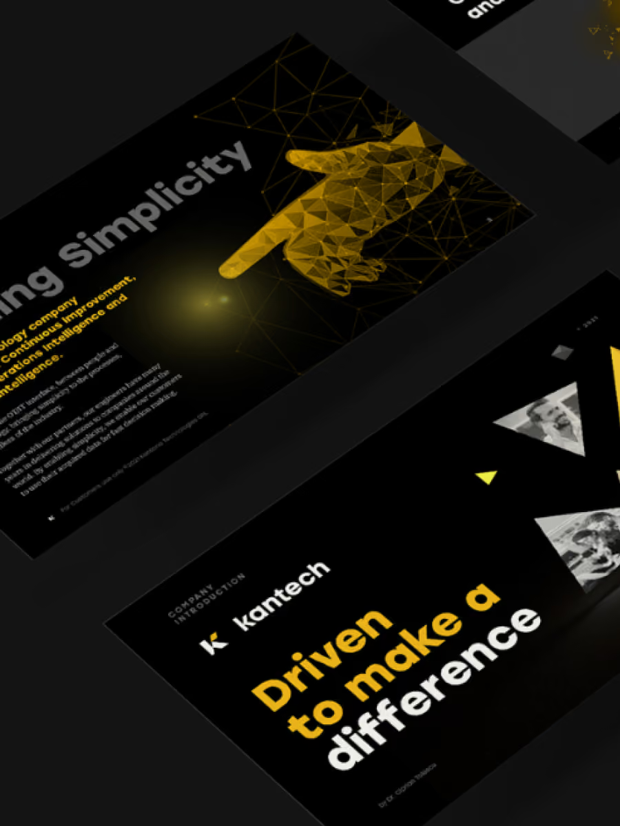
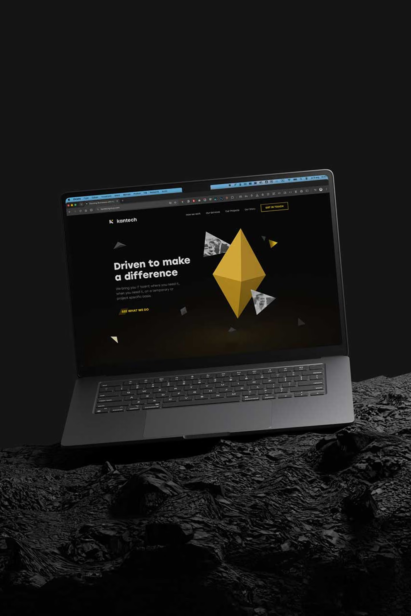
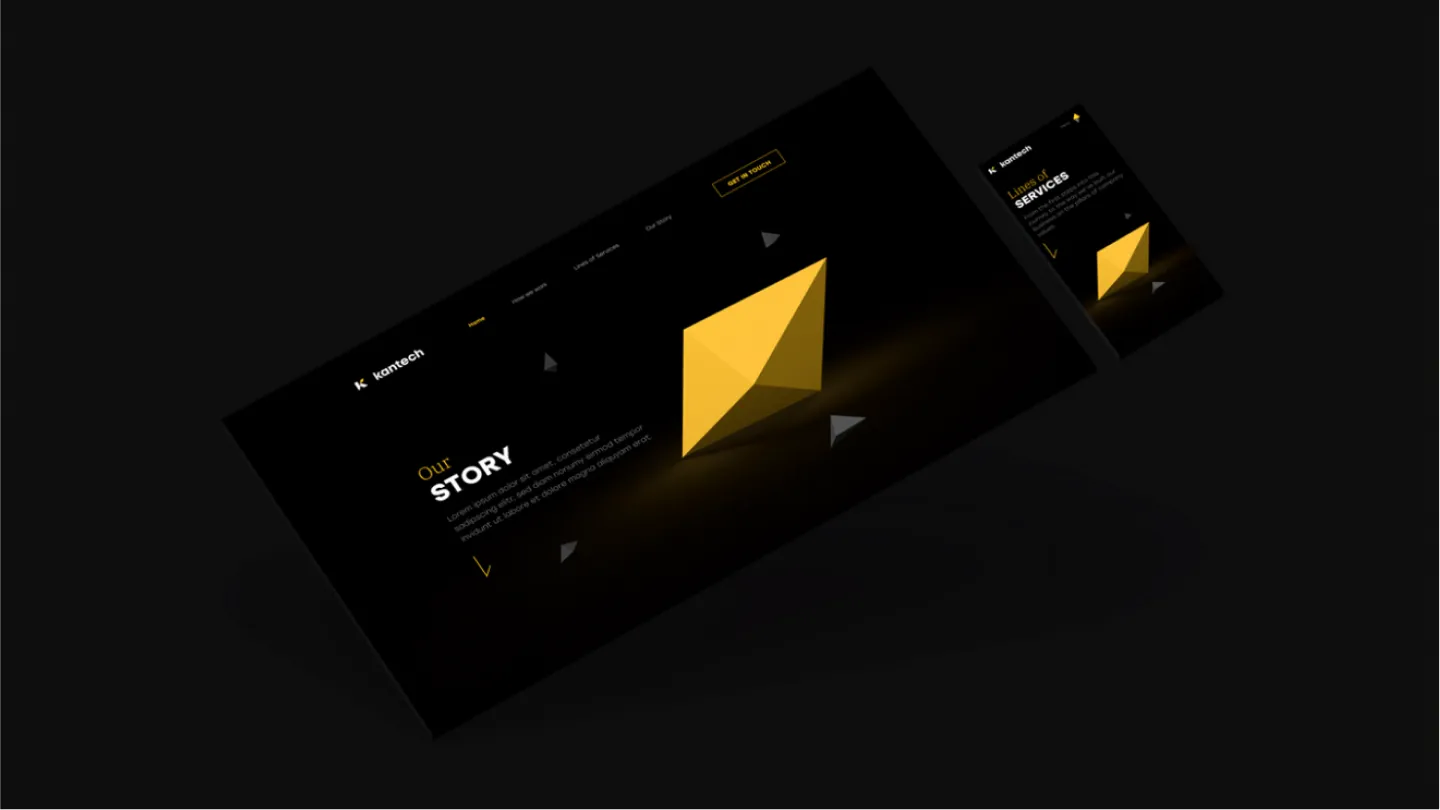
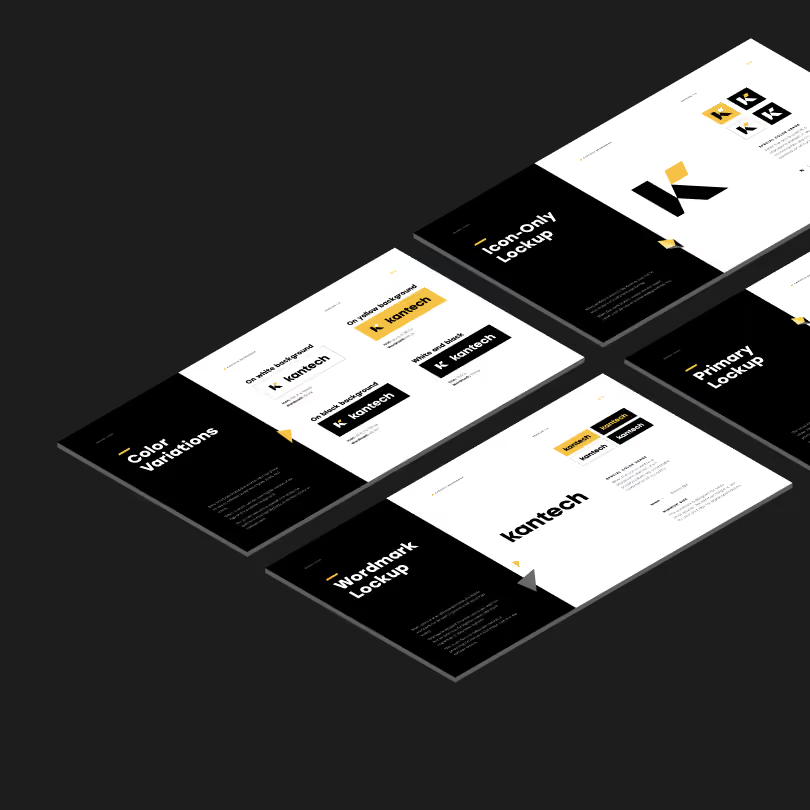
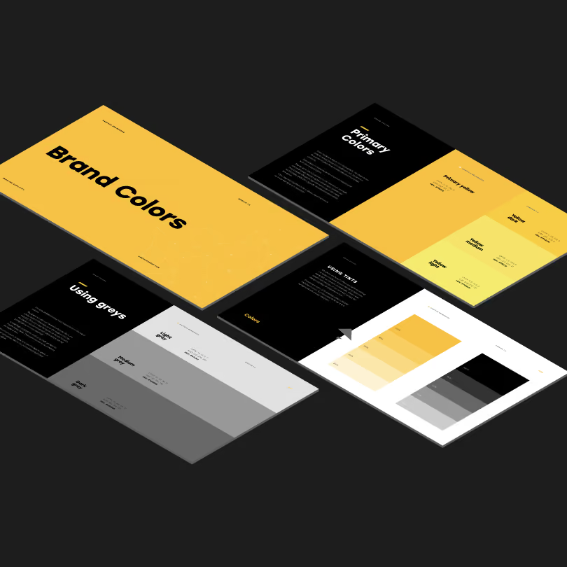
The category is blue, near enough universally. We left it: bold yellow against black. And where the competition puts an abstract network, the primary image is a person's face.
Anyone can say people come first. We had to build a brand that couldn't say anything else.
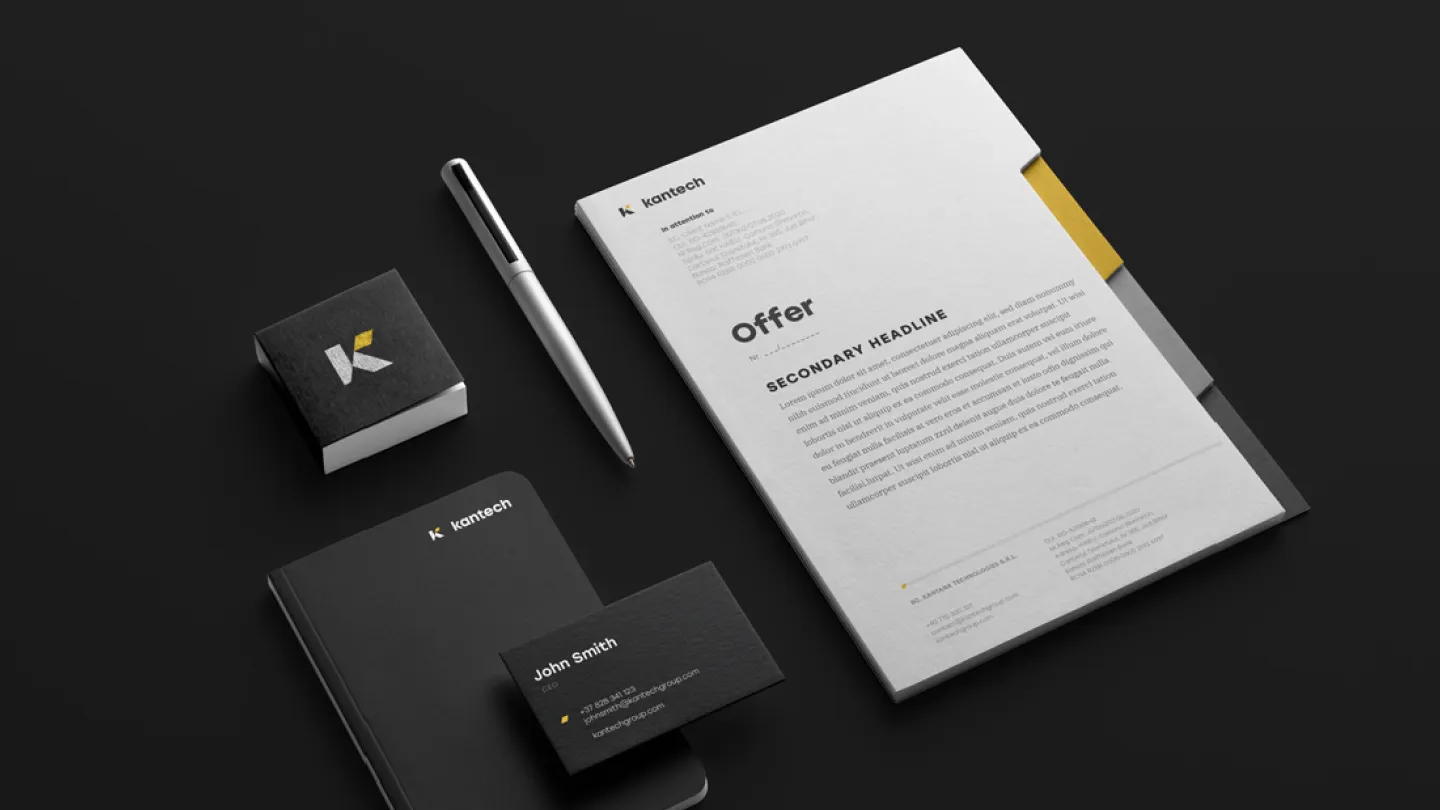
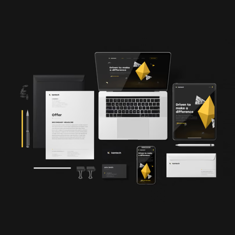
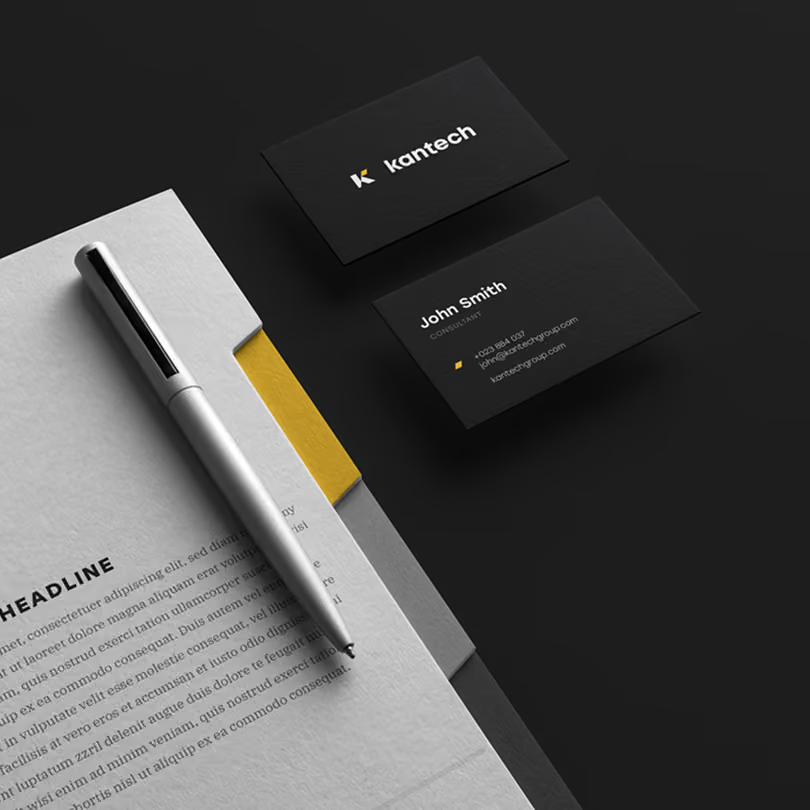
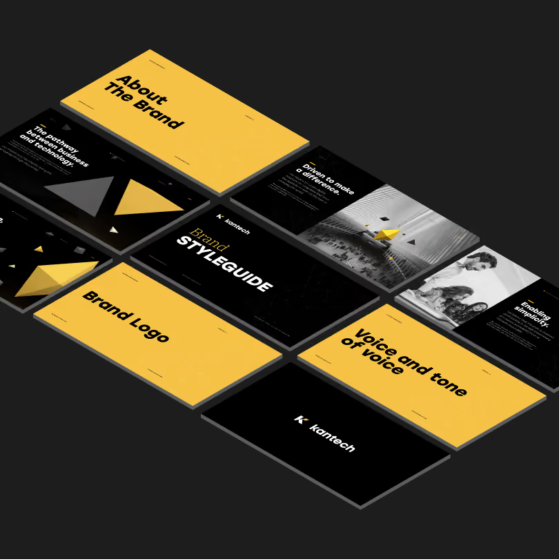
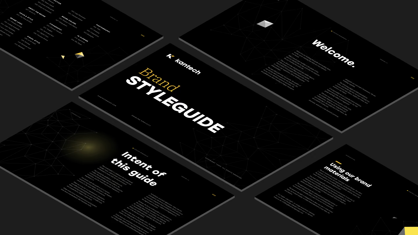
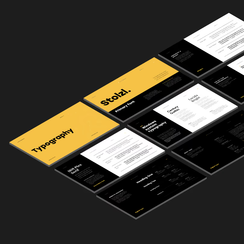
Then the system the company runs on: the mark and its construction, the brandbook, print, presentation and newsletter templates.



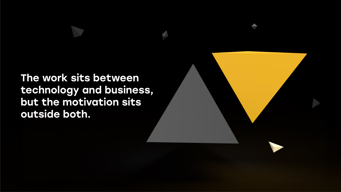
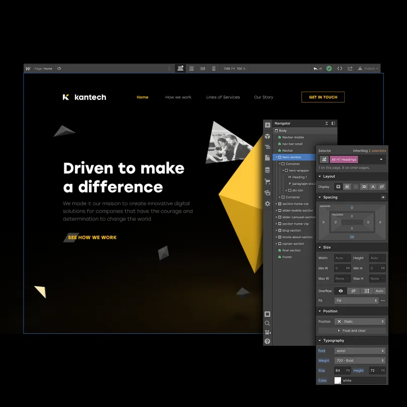
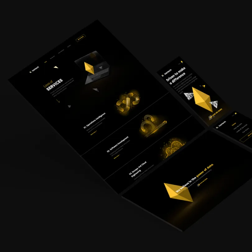
A site written by the people who wrote the strategy
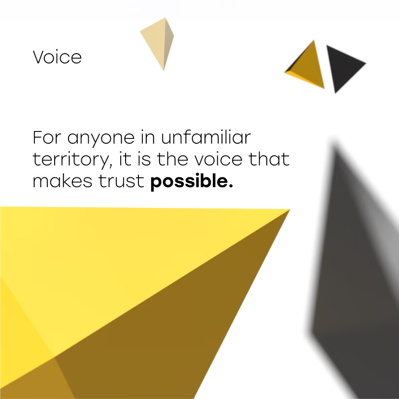
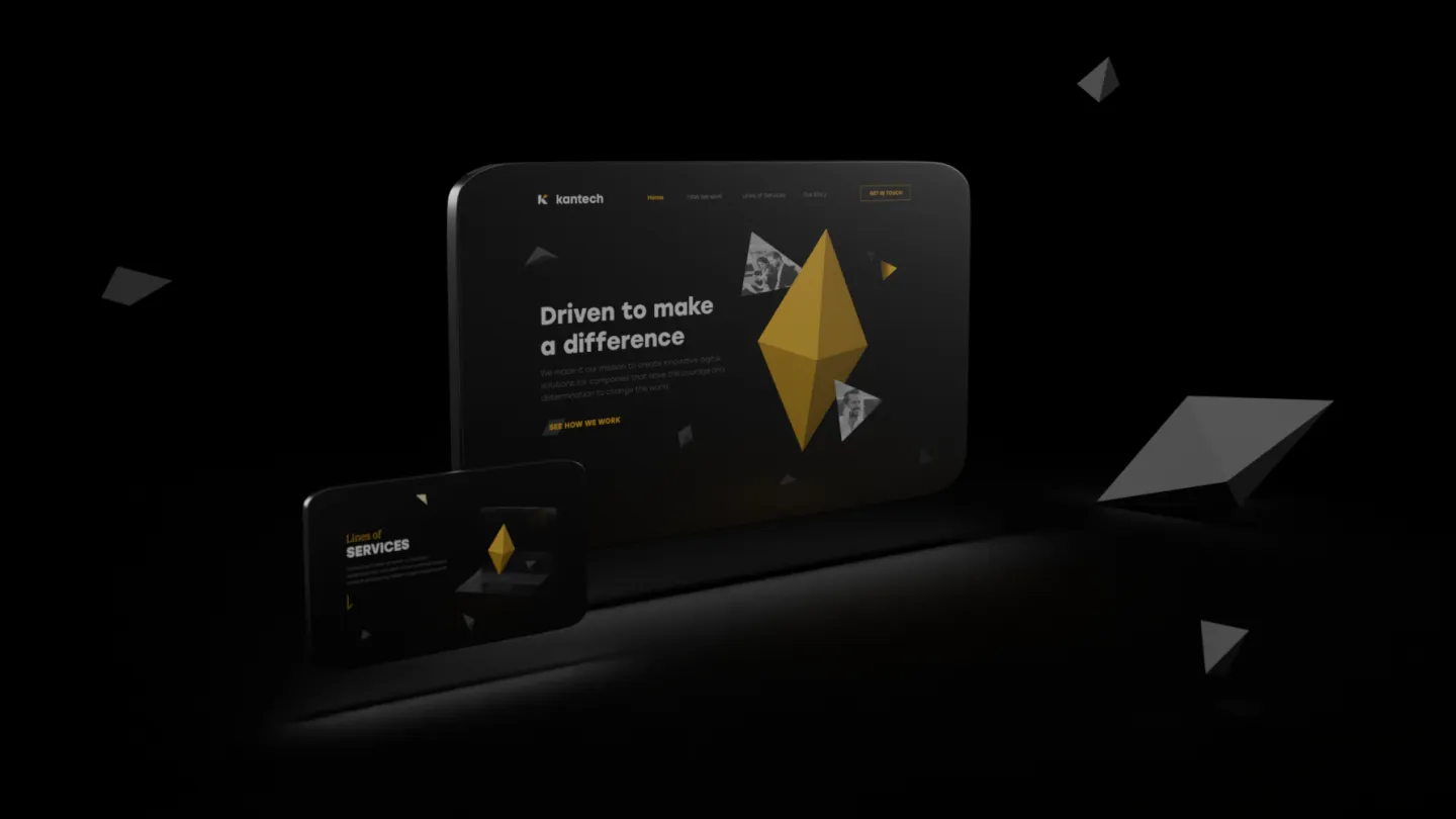
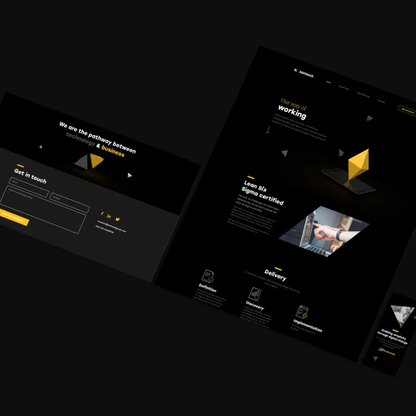
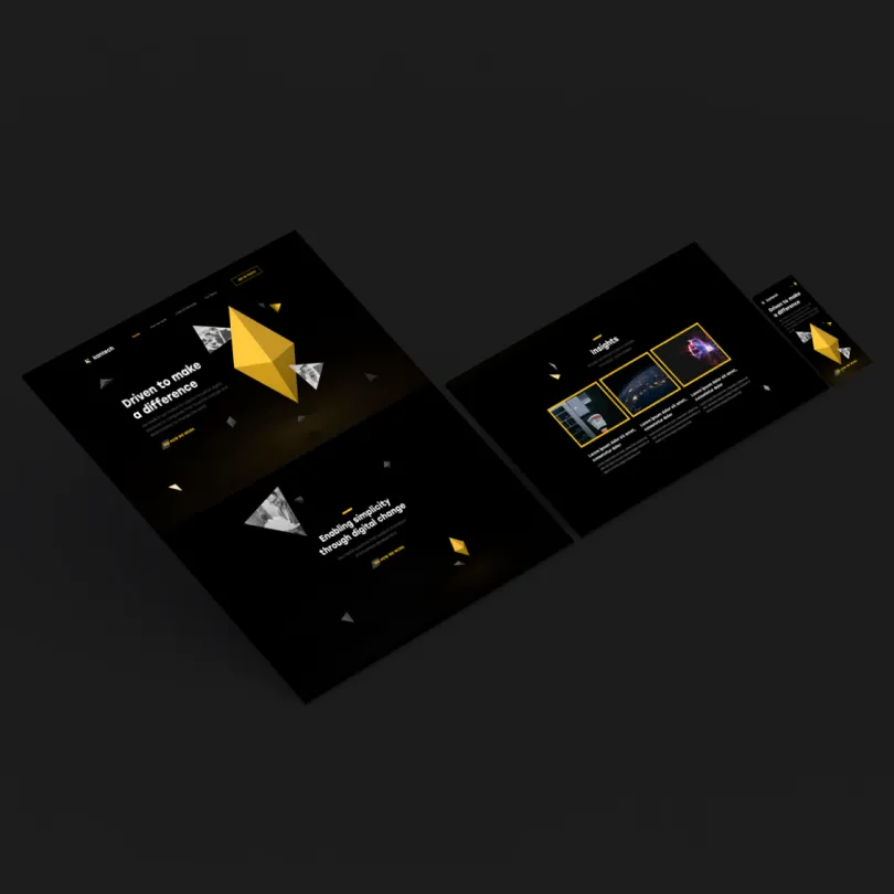
The human-first argument usually dies between the strategy document and the services page, written months apart by different people. Here one team wrote the position, the copy and the build. The order held into the sentences a visitor actually reads.
Portraits as a rule, not a preference
The brandbook makes photography a rule: a person before a product, in every application. That is what stops a positioning like this from disappearing six months later, when someone who wasn't in the room opens the file and needs an image.
The outcome
All I could articulate at the beginning was an ending point, where I wanted to be. The journey did not have even the first steps defined. They put into words every thought I had, before I could name it.
My advice is trust the process. It is like working on a fabric from the back. When you turn it around at the end, it shows a piece of artwork.
Ciprian Tolescu
CEO, Kantech
Closing
The frame outlived the service list
Kantech today sells access to people: professionals placed inside a client's team, alongside operations intelligence and cloud engineering. The service list has moved a long way from where it was at launch.
The brand did not have to move with it. When the position is an order rather than a description of what gets sold, a new service line is something the brand absorbs, not a small crisis.
The purpose is still the one written in those workshops. The yellow is still there.
Share project