Menu
Corbuț had a story to tell and a clear idea of how to tell it. Our job was to find the one thread that held all of it together.Crama Corbuț. Diosig, northwestern Romania. Identity, from logo to label.
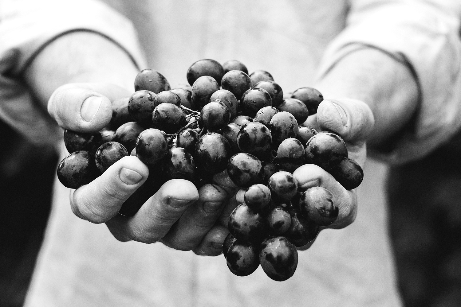
In wine, the story is almost always tradition and family. Both are true, and both are everywhere, especially for small wineries. We wanted to go further. We asked what the winery is really for, what the wine actually does, and where the story lives. The answer wasn’t in the past. It was in the way this family does things.
brand strategy
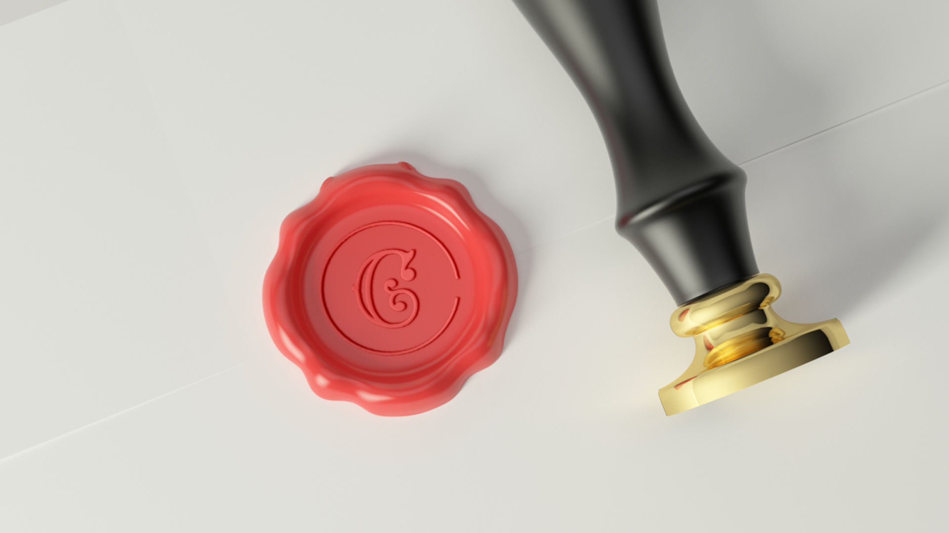
logo
branding
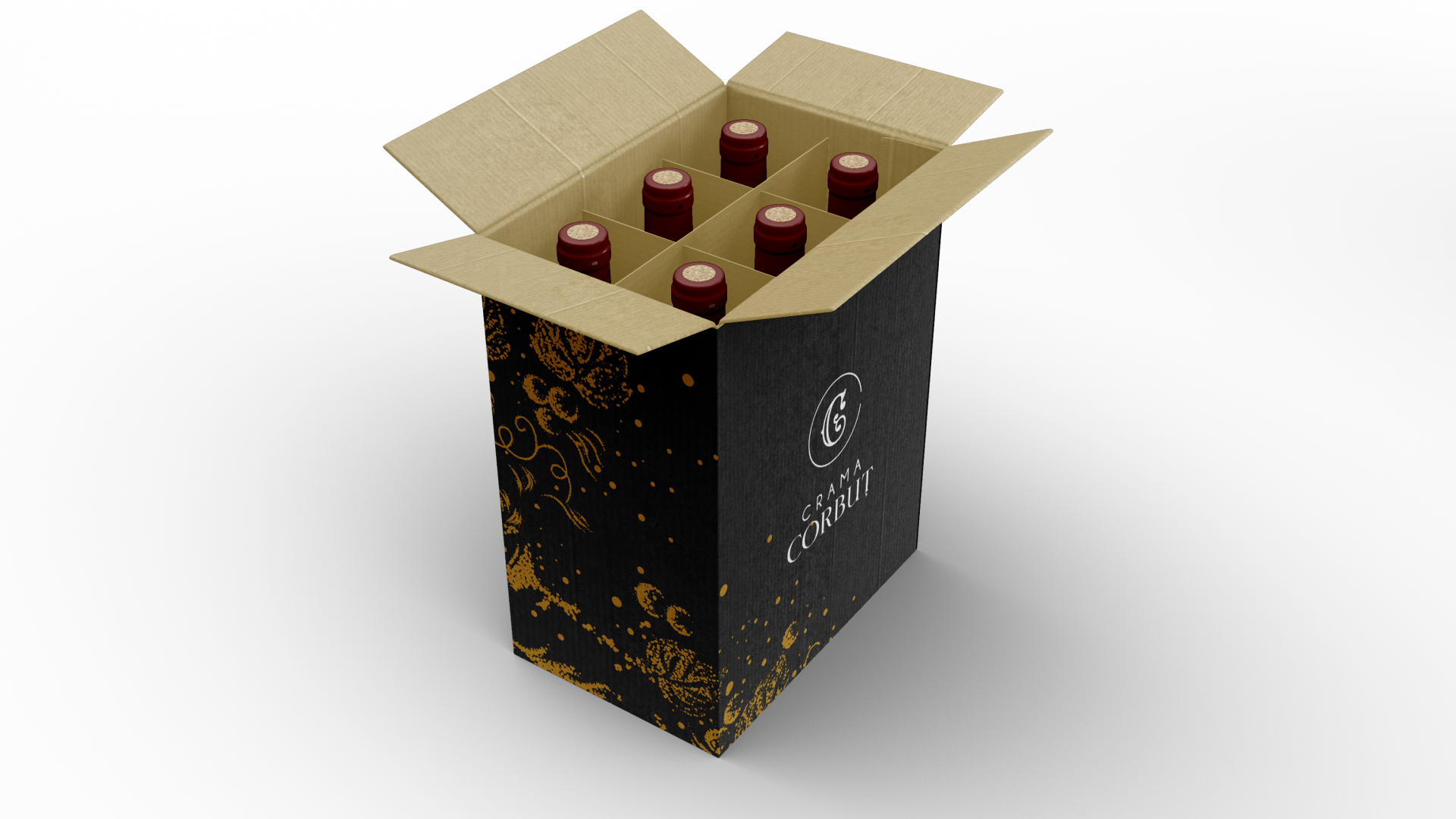
bottle branding
Dan came to us with a story and a strong wish: to build something different, something that was only his. That instinct isn’t new. Doing things your own way is a Corbuț trait, passed down like everything else in the family. So we started there. Not with the wine, but with how this family sees the world.
One sentence said it better than anything else:
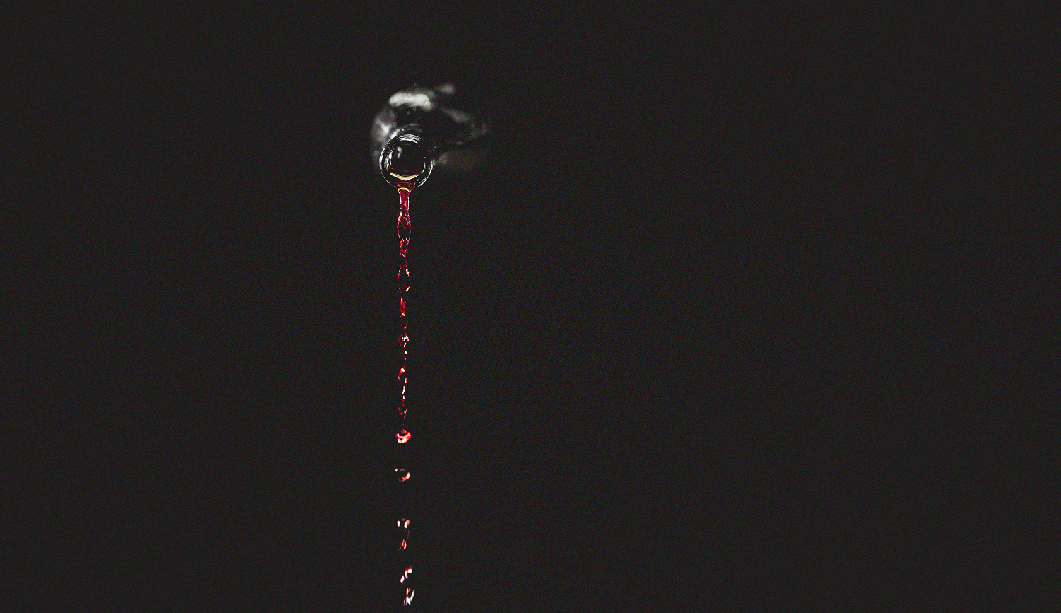
“For us, wine is not the story. It is the storyteller.”
That was the brand. Everything else followed from it.
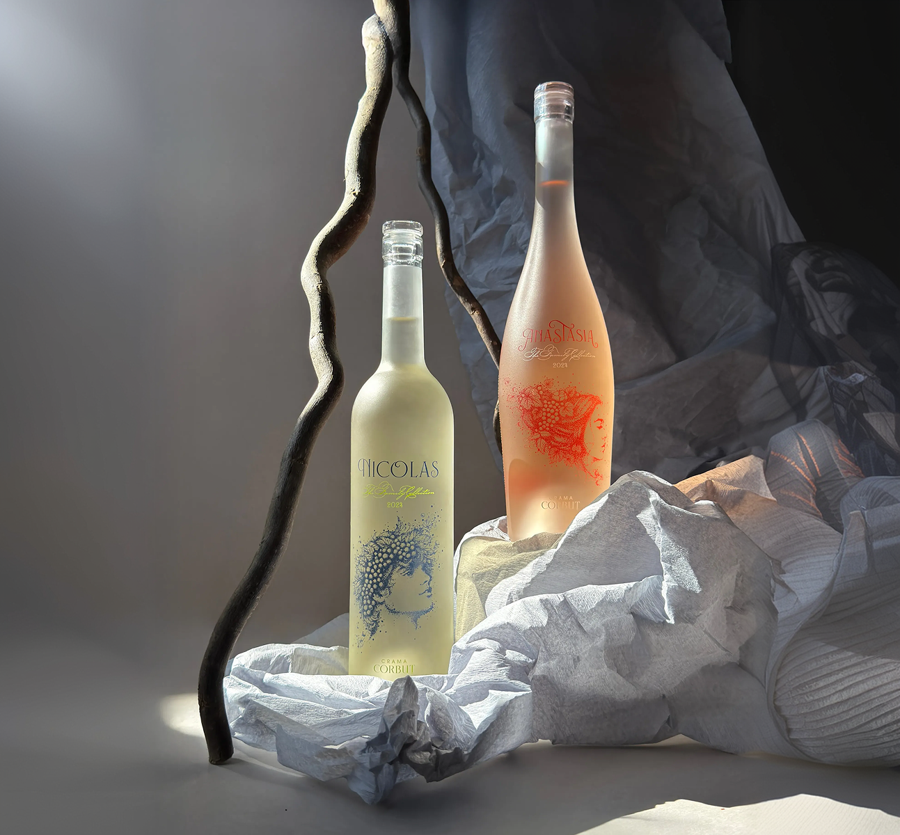
One idea settled the rest. If the wine is the storyteller, the brand isn’t the story. It’s there to carry the voice, not compete with it. So we kept the identity quiet and sure. Warm words, plainly said. Black and white. Room to breathe.
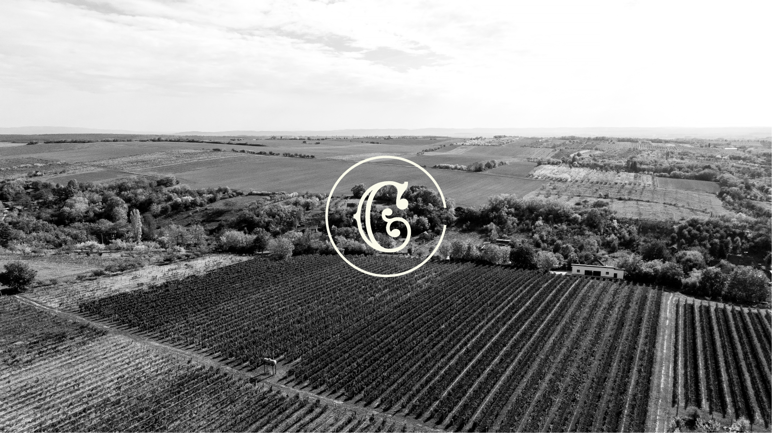
Everything pointed back to one thing: wine as the link between past and future, between the family and the people who taste it. If a choice didn’t serve that link, it came off the page.
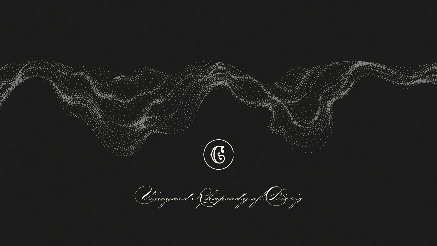
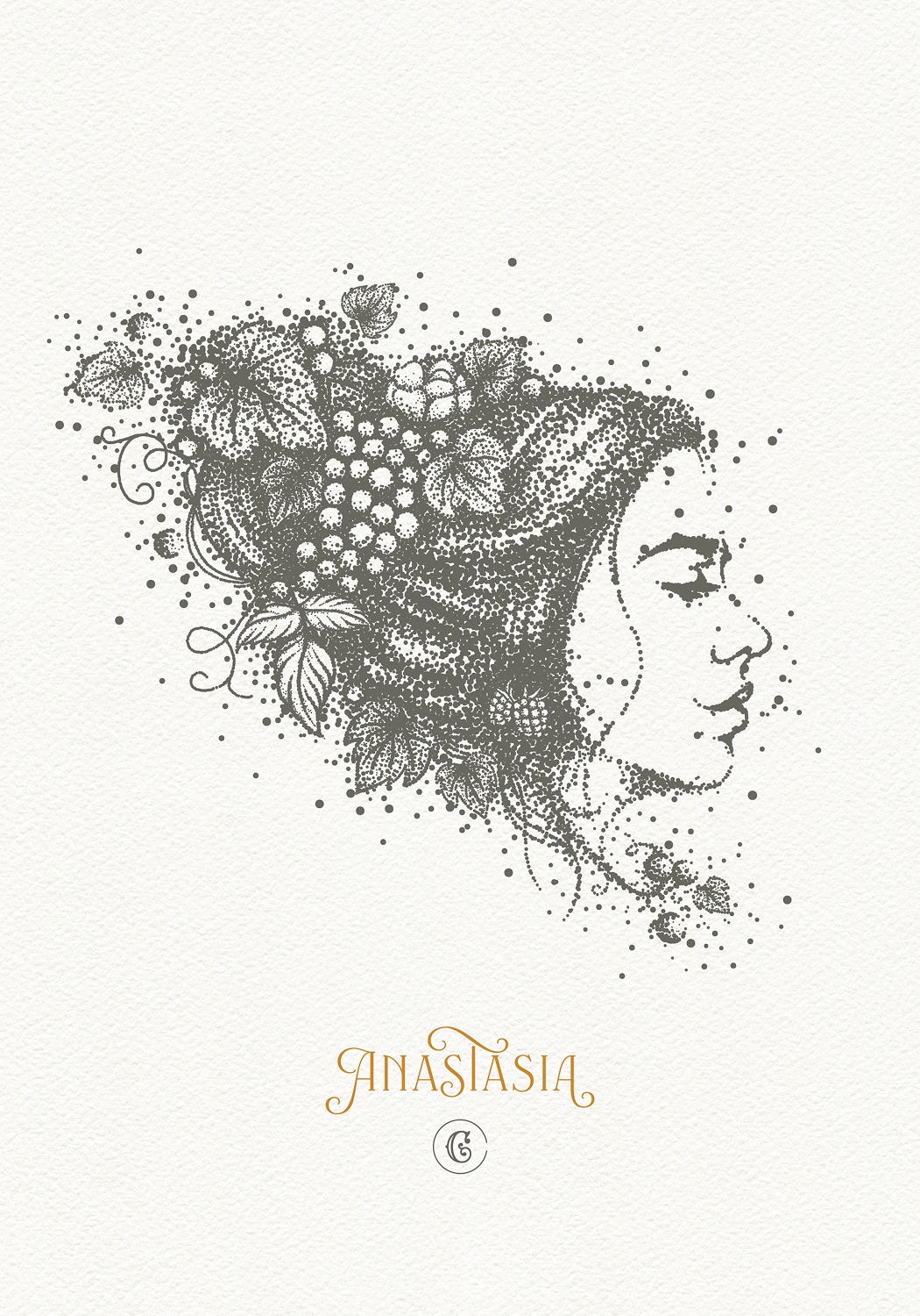
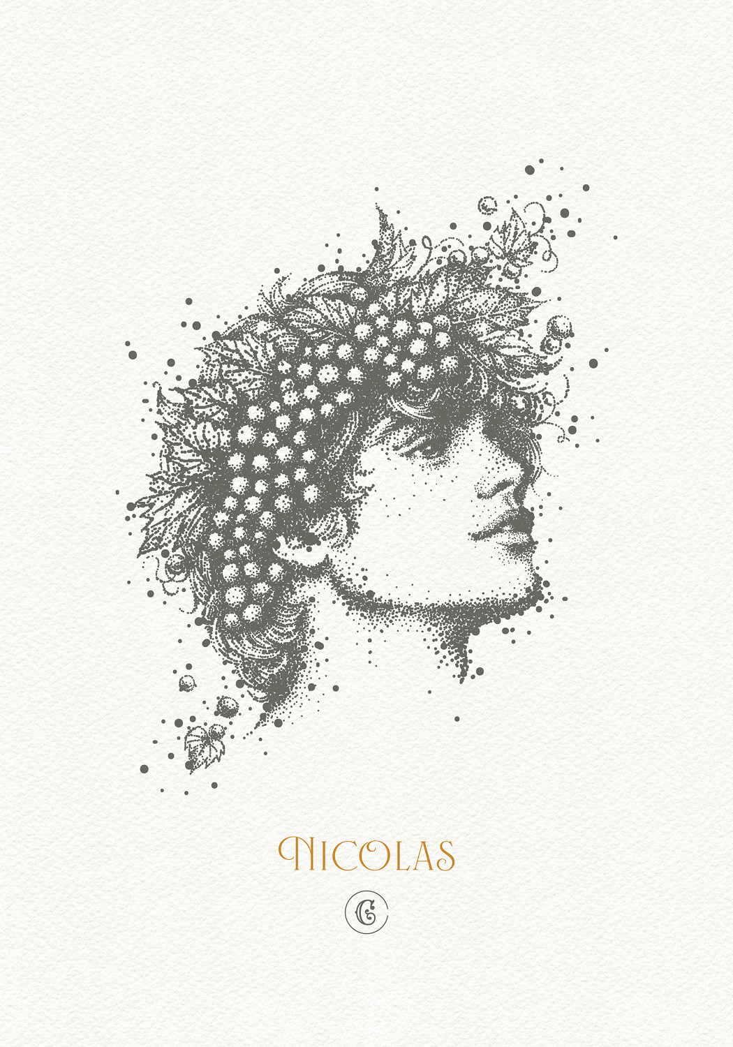
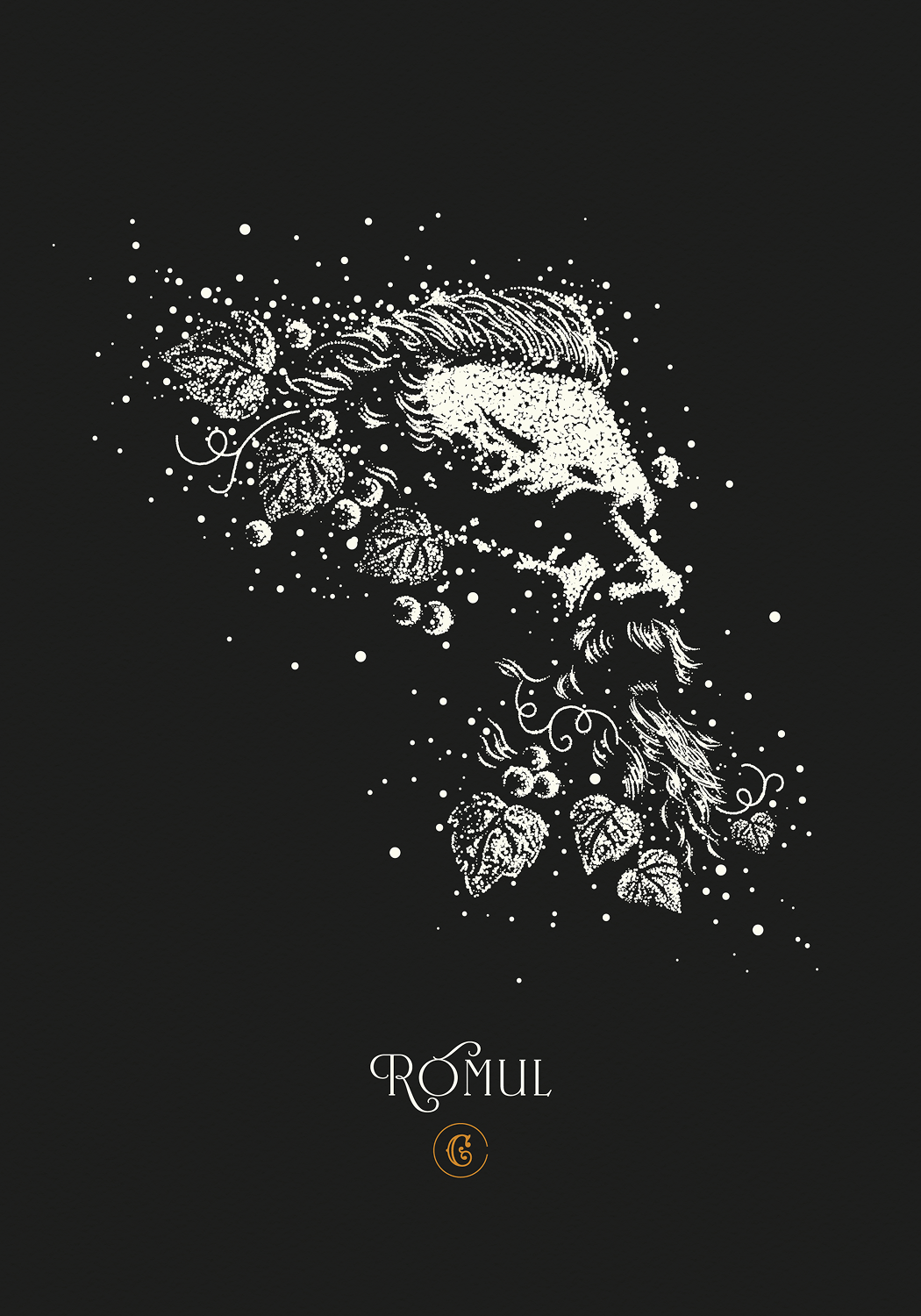
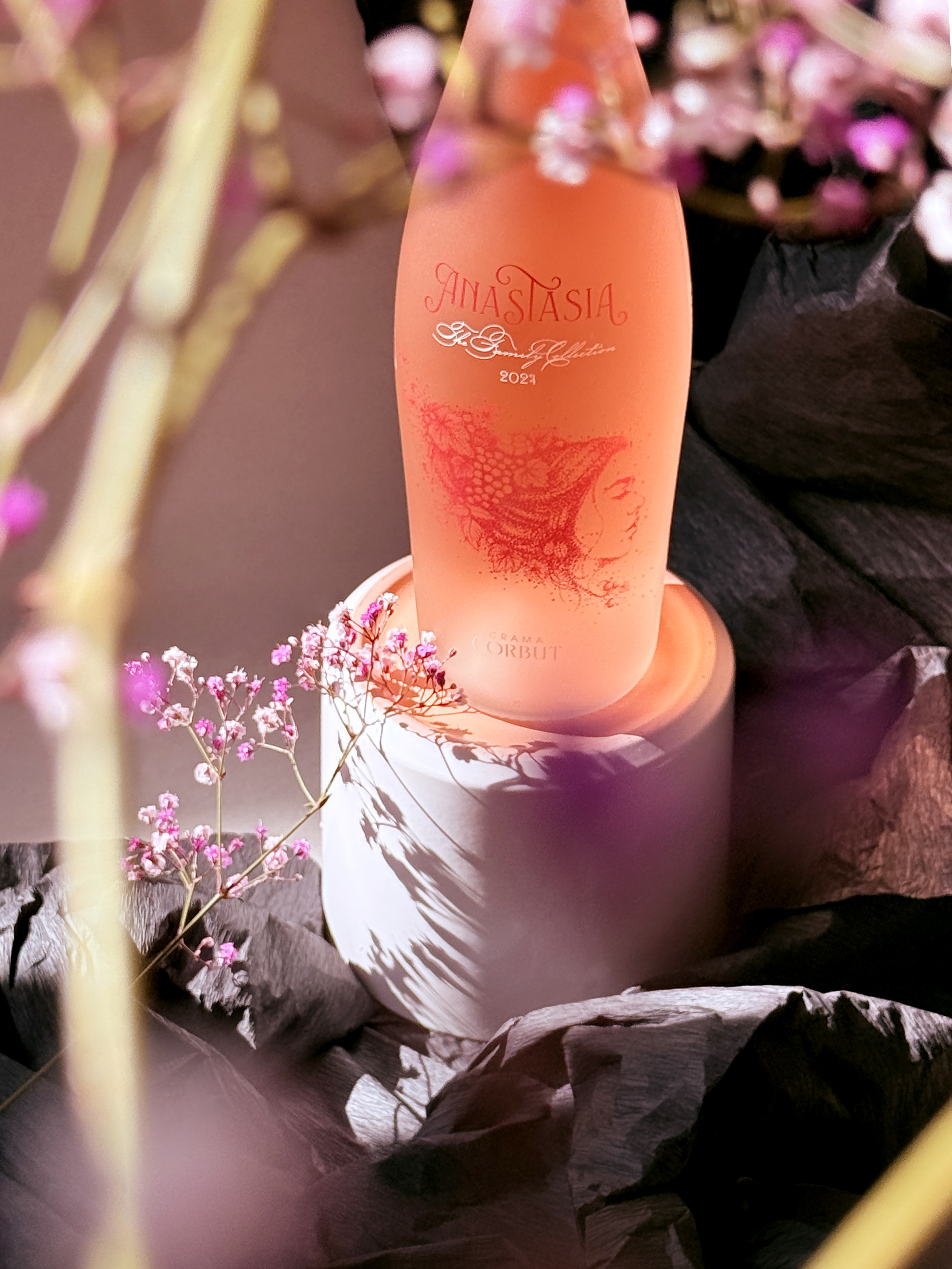
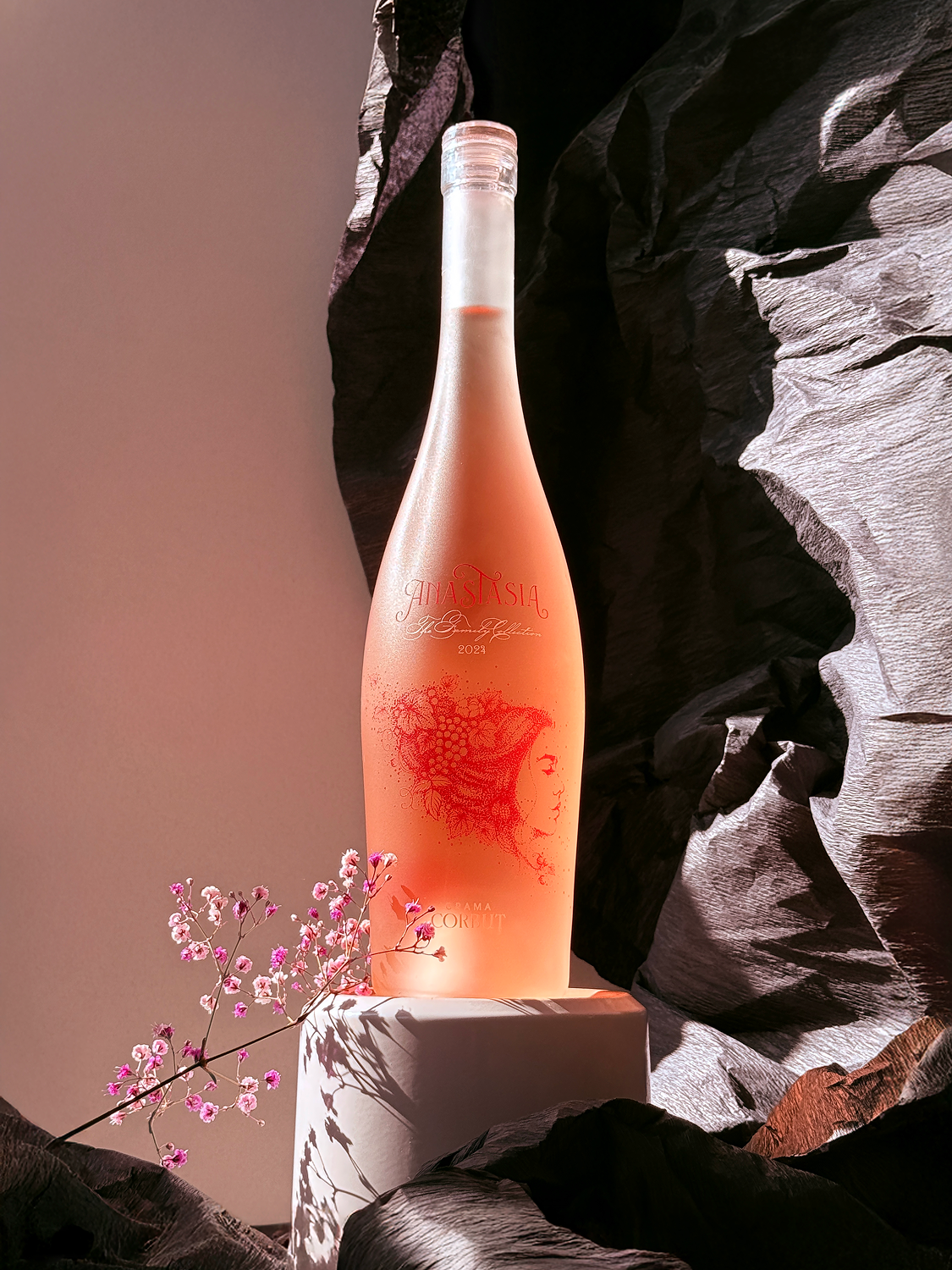
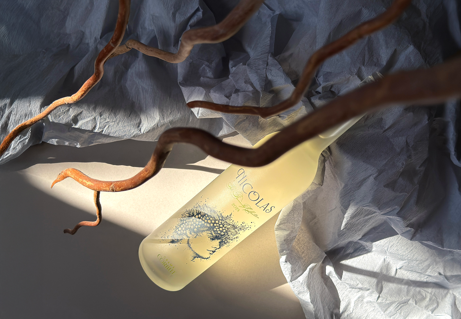
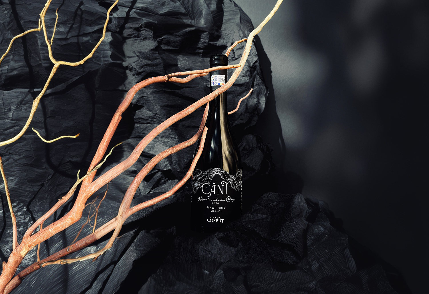
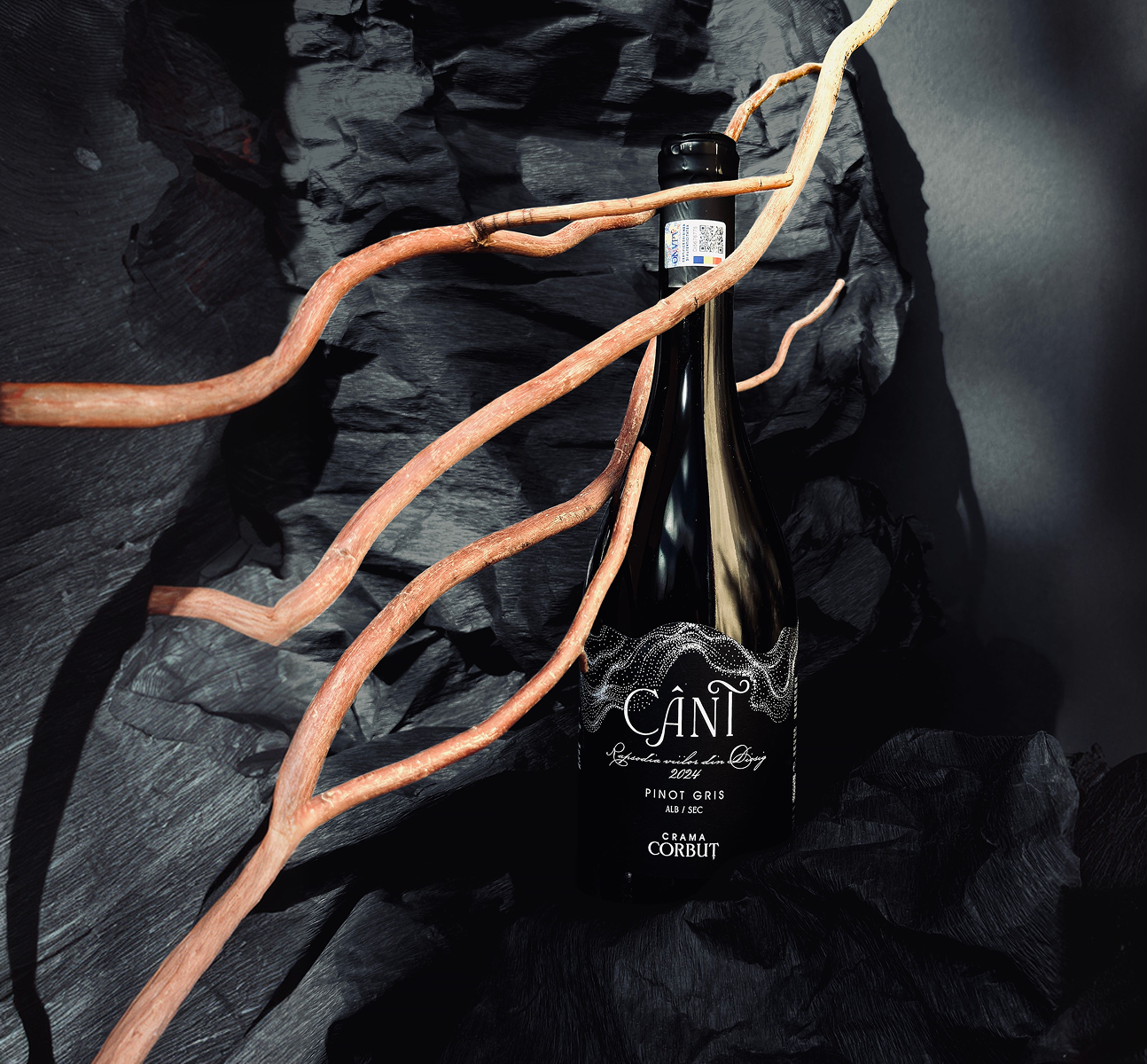
The Cânt range needed a label that was the wine speaking, not decoration. So we let the vineyard speak for itself.
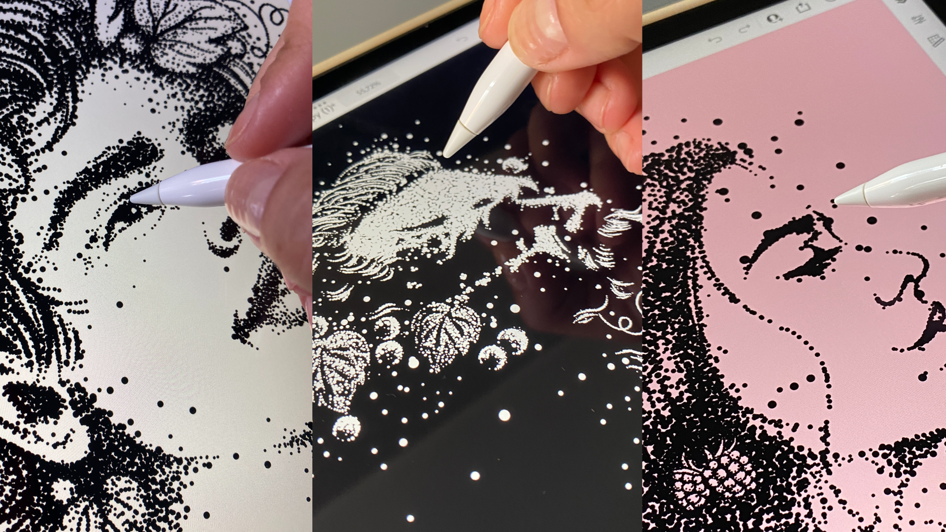
With Plantwave, a device that turns a living plant’s signals into sound, we recorded the vines at Diosig and made their rhythm into music. Cânt means song. The name became literal. The artwork on the label is that sound drawn out. The dots are the recording itself, made visible.
It’s the whole idea in one object: the noise of a living vineyard, becoming something you can hear and see clearly.
The vineyard wrote the first draft. We listened, and kept what mattered.
Corbuț always knew what it wanted to be: a family that does things its own way and leaves something living behind. What it didn’t have was a clear way to say it. Now it does.
The brand still carries the belief the family started with: that wine ties the ones who came before to the ones still to come. It just says it plainly now, so anyone can hear it. That’s the test we hold our work to. Not whether it looks right today, but whether it still holds when the people who built it have moved on, and the brand has to speak on its own.
The brand launched with one clear voice across the whole range, from the everyday wines to the family names. And Cânt gave Corbuț something no one else has: a label that can’t be copied, because it was grown, not designed.